To reach them, a guest would have to walk down a circular staircase into what appears to be a cave, then down more steps to the apartment itself. Built in 1968 as part of Black Bluff, here lived Bill Cody, fabled Laity Lodge director and namesake of the Cody Center for the arts. It has since served many leaders as a spot of needed privacy away from administrative duties.
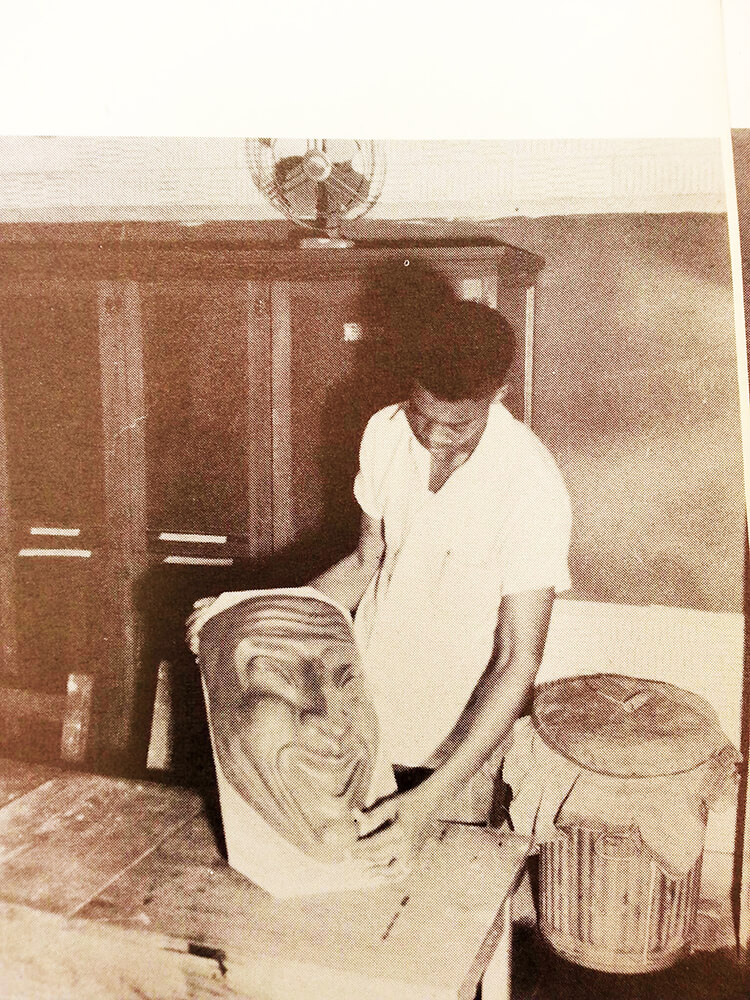
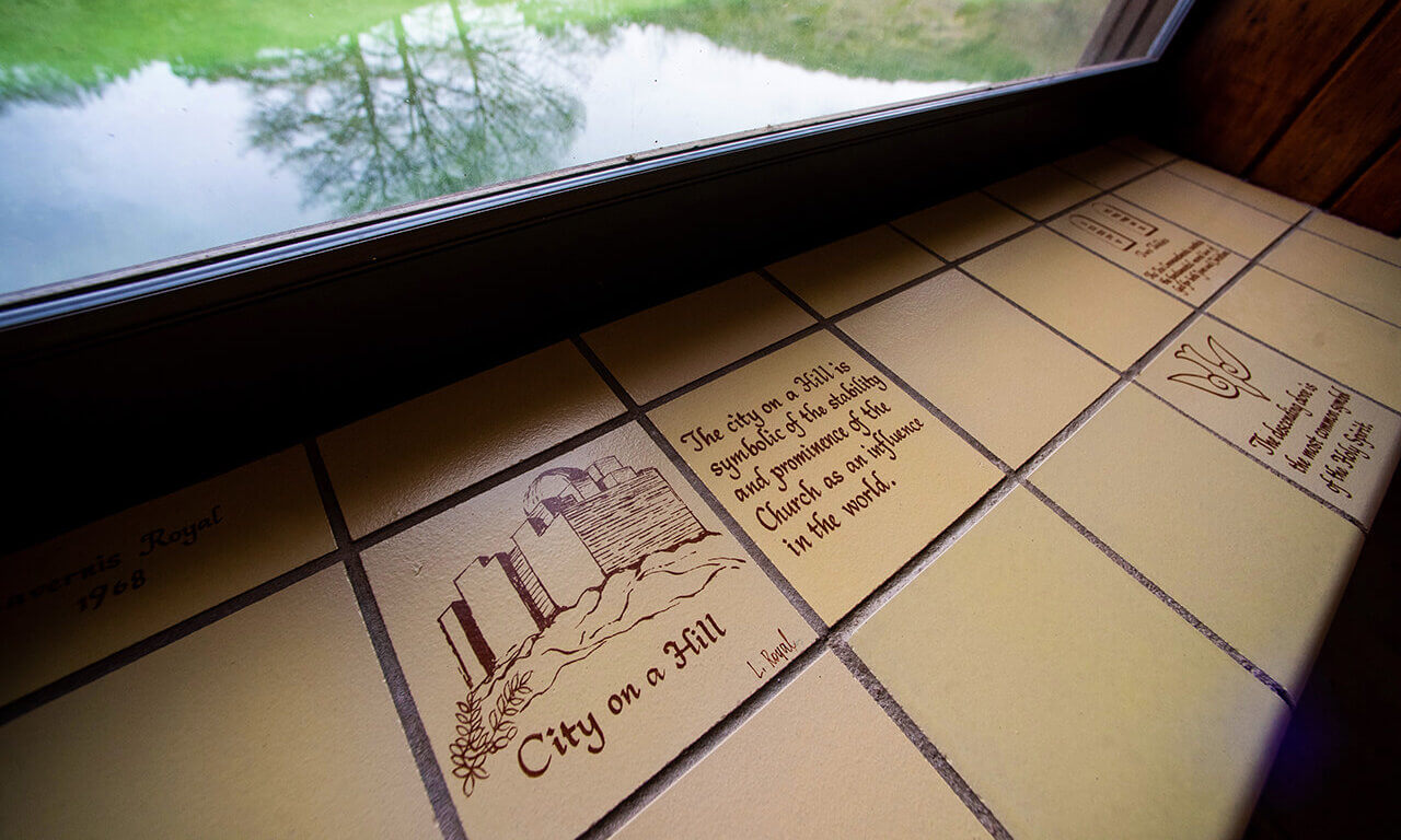
The one-bedroom Lanier Apartment stretches alongside the Frio River, and generous window seats line the entire length of it, made of commercial tile. At least a third of the tiles on the window seats have been customized with signed works by Lavernis Royal, the artist responsible for most of the plaques at the Lodge. His signature—and his story—are easily overlooked.
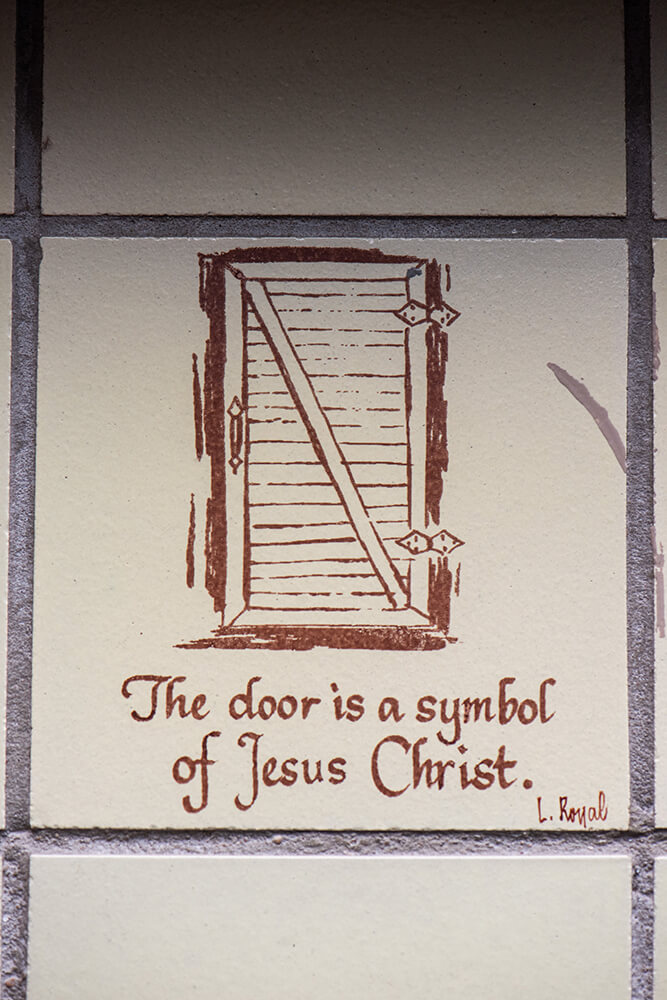
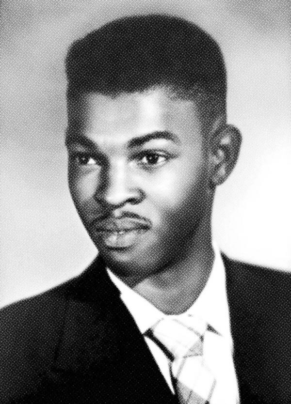
Lavernis Royal (1935–2008) was employed by H-E-B for over 40 years in the Signage and Design department. Most likely, Mary Holdsworth Butt hired him to create these flourishes, one of many design decisions that make Laity Lodge so original. She specifically avoided Scripture in public spaces that might feel off-putting to non-Christian guests, but Mr. Royal’s tiles at the bottom of Black Bluff are explicitly Christian illustrations of Biblical symbols, Bible verses, and poetry, providing a hidden haven for a minister experiencing the “holy depletion” of pastoral care. Gospel reminders were needed here—stalwart yet meek.
Art history does not tell us much about Mr. Royal himself. He was married and had two children. As a young man, he won a state-wide competition for “Mr. Future Teacher of Texas.” He was a Sunday school teacher at St. John’s Baptist Church in Corpus Christi and an active member of the N.A.A.C.P.
And he was a versatile artist, skilled in calligraphy as well as sculpture, including his 26-foot-high bronze and copper mobile of seagulls in the atrium at the Nueces County courthouse, built in 1977.
Long before, Mr. Royal was a trailblazer, a Hall-of-Famer at Del Mar College in Corpus Christi, part of the first class of an estimated 30 Black students to integrate this school in Corpus Christi in 1952, two years before the Supreme Court decision barred school segregation in Brown v. the Board of Education. According to Harper’s Magazine, Del Mar College’s integration of Black students went smoothly. It is hard to know how much we should trust that source from 1950s America, but Mr. Royal was immediately elected to leadership in the student council. He went on to study at Texas Southern University, which at the time was a burgeoning hot spot for Black artists.
These tiles are not homogenous. They are handmade, not a commercial product, and they vary in material but not style. Although calligraphy is a prescribed craft where perfection is desired, the hand of the artist can be felt. From a stylistic comparison, it is quite likely that the same hand did the calligraphy on the indoor and outdoor tiles. This distinctive handwriting is the connecting factor on older tiles throughout Laity Lodge. Newer inscriptions are not in clay but cut deeply into stone, likely laser sandblasted, much like modern monuments.
Inside Lanier, Mr. Royal used typical commercial tiles, 6” x 6”, glazed in a cream color, as his canvas. Some are darker than others; some more delicately drawn. The beauty of calligraphy is in the stroke of the slanted pen tip—the pressure of the pen adjusts to the flow as the writing proceeds—the ink will thus be deposited unevenly, and you can tell when the ink ran low and the pen had to be refilled. This is noticeable on the paler, sienna brown tiles.
 Mr. Royal silkscreened some drawings onto fired tiles as well. Silkscreen, or serigraph, is a process of stenciling which makes identical multiples possible. And indeed, there are three tiles of the same image for the Alpha & Omega symbol, the Chi Rho symbol, and the Trinity. I’d venture to say one tile with a paler drawing is the original, from which the artist made stencils to create the others. Perhaps the designs were considered for other guest rooms in Black Bluff, which also have window seats overlooking the river. The tiles in those window seats, however, are blank.
Outside, the Black Bluff room name plates are not silkscreened, but each is hand drawn with a style suggesting they are very likely also the work of Mr. Royal. These, in a terra-cotta clay, differ slightly in finish, some more shiny than matte, indicating he tried various clear overglazes.
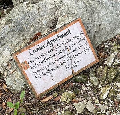
The more public plaques (I counted 22 and know there are more) are more complicated. The tiles themselves were handmade in a studio somewhere, out of a richly textured clay, and fired at high heat. They are large bricks, about an inch thick, not industrial tiles. Some are cracked, some have been relocated, but five or six decades of hill country weather proves their durability. The original tiles were sunken into a rock, not merely adhered. Somebody had to chisel out a hollow in the stone and then cement the finished tile in there. Had these been painted on the spot, the inscriptions would’ve worn off. Fired stoneware ceramics have longevity; pots and tiles from ancient times prove this. The technique used on the landscape ornaments are different from that used on the indoor and the room signage tiles. Again, Mr. Royal experimented as he went, finding that a layer of underglaze between the clay surface and the calligraphy rendered a smoother surface for his calligraphy pen. It is not easy to do precise lettering on a bumpy surface, and furthermore, those pens are designed for free-flowing ink, not ceramic glazes or stains. There are some Lavernis Royal flourishes in certain letters, especially the capitals which are enlarged on the first word much like a medieval manuscript. And lest we think these are made by a robot, at the entry to Black Bluff, a quote by Edna St. Vincent Millay shows where the artist almost ran out of room, having to cram letters together on the last line. Any calligrapher knows that dilemma!
Why do these technical details matter? Artists experiment with a medium to find their way. As the adage goes, God is in the details.
In the Lanier Apartment, somebody cared enough to personalize this space in a way that does not detract from the key feature—the flowing Frio, right out the window. The tiles are not flashy; however, they contribute to an immersive experience. Their natural colors blend with the magical scene outside. Their placement on the window seats directs us to the scene beyond, to look past the work of one creator, Lavernis Royal, to the generous bounty of the Creator who inspired that work.